How to: Simplified output data treatment with Excel
This tutorial presents a time-saving workflow to process output data from Sympheny into flexible tables and graphical representations. The workflow takes advantage of two in-built Excel features, Pivot tables and Power queries.
Objectives of the workflow
Using this workflow you will be able to:
Design project-specific results tables (e.g. table with all technologies, order by hubs, with their capital and O&M costs)
Compare multiple scenarios and/or projects with these tables
Update these results tables simply by copy/cutting the latest outout.xlsx data in the correct folder
Overall, the goal here is to allow users to save time and reduce manual errors in their Sympheny data treatment.
Steps of the workflow
The following steps must be undergone:
Automated loading of the most recent data into Excel using Power Query
Create a folder and name it for example ‘Latest Input’. Create an other one for the Summary excel sheets from the output.xlsx folder (name it for example ‘Latest Output Summary’).

Enter the input and output files of the scenarios you want to consider for your analysis in these folders. In the ‘Latest Input’ enter the input.xlsx data, the the ‘Latest Output Summary’ enter the excel sheet listed as ‘summary’. These folders should only contain excels with data you want to work on and no others.
Both data is downloadable from the ‘Execution’ page of your project (in V3)
Now create an excel file, called for example “Summary.xlsx” (do not save it under the ‘Latest Input' nor ‘Latest Output Summary’ folder). This excel file will be the data where you will load all the data from your latest scenarios, using Power Query.
Open your ‘Summary’ excel
Go to ‘Data’ > ‘Get Data’ > ‘From File ‘ > ‘From Folder'
Select the folder you want to join data for (e.g. the ‘Latest Input’ or the ‘Latest Output Summary’ folder)
Select ‘combine and load’
Select the sheet you want to combine (these steps will have to be repeated for each sheet you want to consider). Select the sheet you want to load and click ‘ok’. Rename the sheet for clarity.
Repeat for each sheet which has data you want to consider.
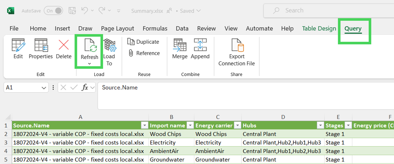
Should you change the excels within the folder, you can click on the query table and click ‘Query’ > ‘Refresh’.
Project-specific data tables with Pivot
Based on the different tabs that have been loaded within the ‘Summary.xlsx', you can now create Pivot tables.
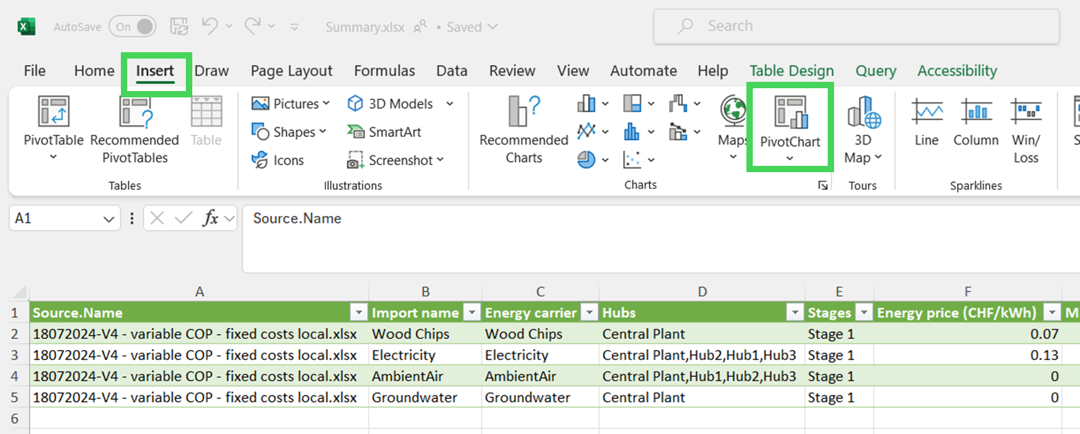
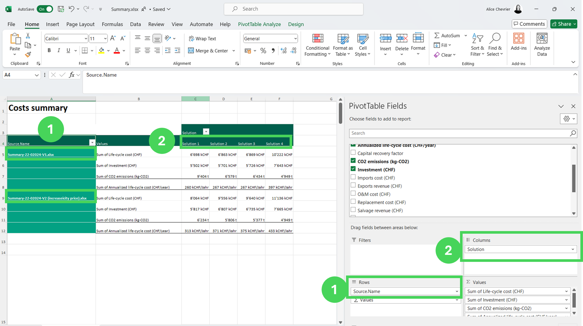
a. Select one of the (Power Query) tables and click ‘Insert’ > ‘PivotChart’ > ‘Pivot Chart and Pivot Table'.
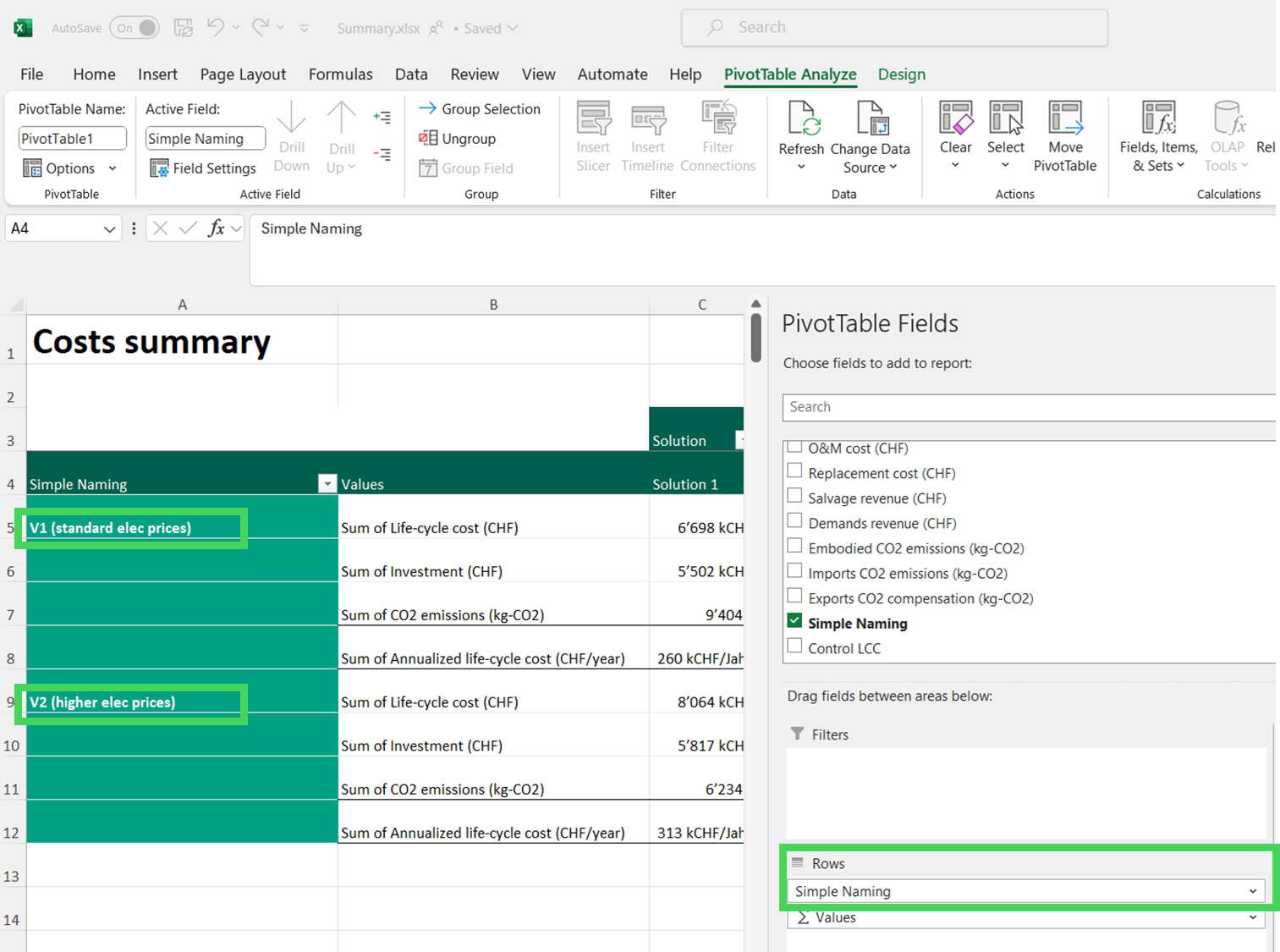
b. This will generate a new tab with your Pivot table. Design it the way you want to your project. This excel Summary-TemplateExample.xlsx gives a first idea of what can be realized with this workflow. Under the Tabs ‘O_Summary' and ‘I_Summary’ you will find the different pivot tables that were created for this project.
The tabs with the lighter colors contain the data as loaded with Power Query. The tabs with the prefix ‘I_’ indicate input data, the ones with ‘O_’ indicate output data.
The fist table of the ‘O_summary’ tab, shows how practical this workflow is to have a fast overview of different data for different scenarios:
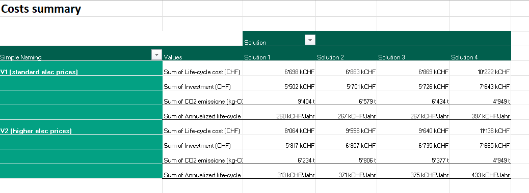
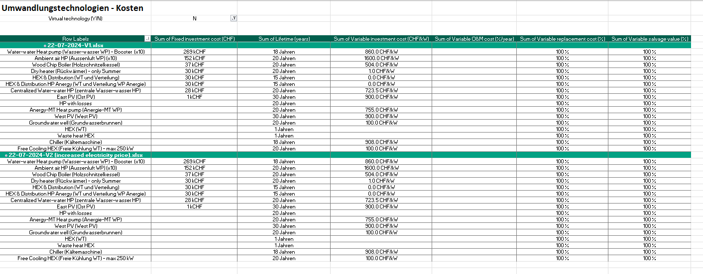
The same can also be realized based on the input data. This allows to have a clear and concise overview of specific boundary conditions entered within the analysis, see the first table of the ‘I_summary’ tab where one can find the different cost assumptions and lifetime for the technologies entered within the scenarios.
Note that this workflow is very flexible and can be fully adapted to fulfil your needs and representation wishes.
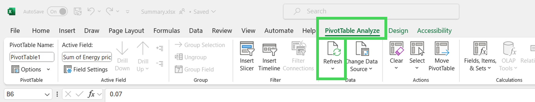
Refresh Data and Pivot
To get the latest data within the different tabs of your ‘Summary.xlsx’ and within the Pivots, you will need to refresh the data. For refreshing everything in one go, click on a Pivot and select ‘Refresh’ > ‘Refresh all’. This will refresh all your Power Query and Pivot tables.
Should you get an error message, read it carefully! Standard error messages are due to not enough place being available to update the table (make sure you add enough free rows between pivot) or the fact that the data it is based on might have been moved. Sometimes the Power Query also has issues finding the keys (error message ‘The key didn’t match any rows in the table'). Generally, this is solved by opening the excel that is referred to and re-naming (with the same name!) one of the tab and saving it again.
Note that in the case on an error message, the refreshing is stopped. Meaning you will need to refresh all the data once again, once the source of error has been found.
Design Tipps for Pivot tables
Do always disaggregate by ‘Scenario.Name' (and by ‘Pareto Points’ when working with output data). Otherwise, the data in your Pivot will show as aggregated across multiple scenarios / multiple points.
If you would like to add a category for sorting your data or to rename specific fields, do the following:
Create a tab and name in ‘key’
Create a table with the correspondences. As an example, in one column enter the excel source names (as automatically loaded by the Power Query) and fill in the corresponding ‘client friendly’ naming
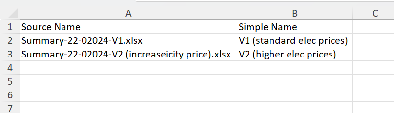
Within the specific power query tables, add a new column in which you will match the source name to your client friendly naming.
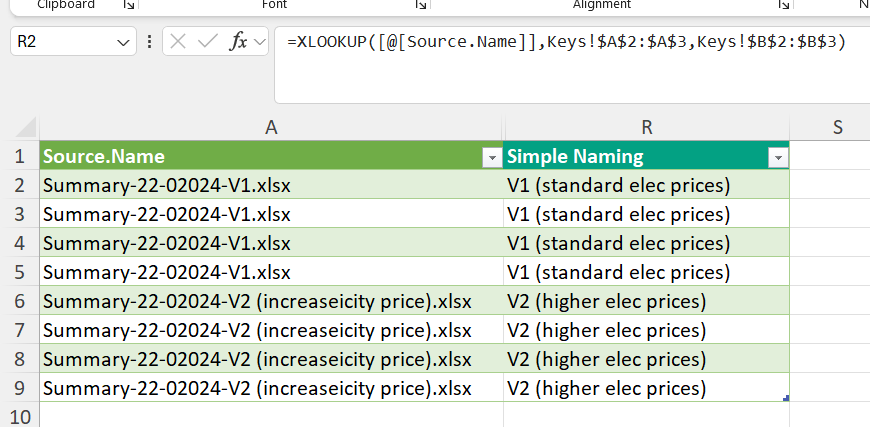
Finally, use this naming within your Pivot table.
Please be aware that using this type of workflow, you will need to upload your correspondences' table as soon as you will consider new sources names.
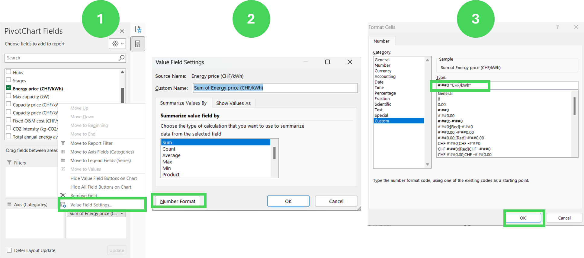
You can set units to your data values. For this click on your Pivot table and within the ‘Pivot Chart Fields', right-click on the value you wish to add a unit to and select ‘Value field settings..’. Then, click on ‘Number Format’ and finally select the unit you wish to add for this field (select the ‘custom ' category and add the unit within guillemet (““). Note that adding a apostrophe symbol is equivalent to a division by 1000. This can be very helpful when dealing with high numbers (e.g. if you have 100000 as kWh, you can set the unit to “#’##0’ “MWh” to have it display as MWh instead of kWh).
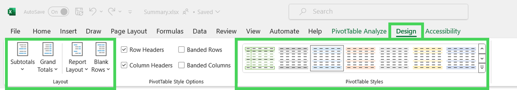
When clicking on a Pivot table, you will have access to its ‘Design’ features (click on ‘design’). Here you can play with the layout options. These generally help to define clearer graphics for your template, for example by avoiding sub-totals, which might be confusing depending on the data you are displaying. Do also not hesitate to look within the different Pivottable styles to select the one which fits your esthetic most (you can also defined a custom layout, for example, one matching your presentation layout).