
Results Dashboard
Upon opening the dashboard, you are brought to a Scenario Dashboard that contains an overview of all optimal solutions. On the upper right menu, you can access Solution Dashboards for each optimal solution, and each hub (if more than one was defined in the model).
Scenario Dashboard
The Scenario Dashboard is a great place to start exploring the results. Here you can find a summary of the following information regarding this scenario:
Optimal solutions and their objectives
Cost summary
Optimal design and operation
Energy demand summary
Total energy flow summary
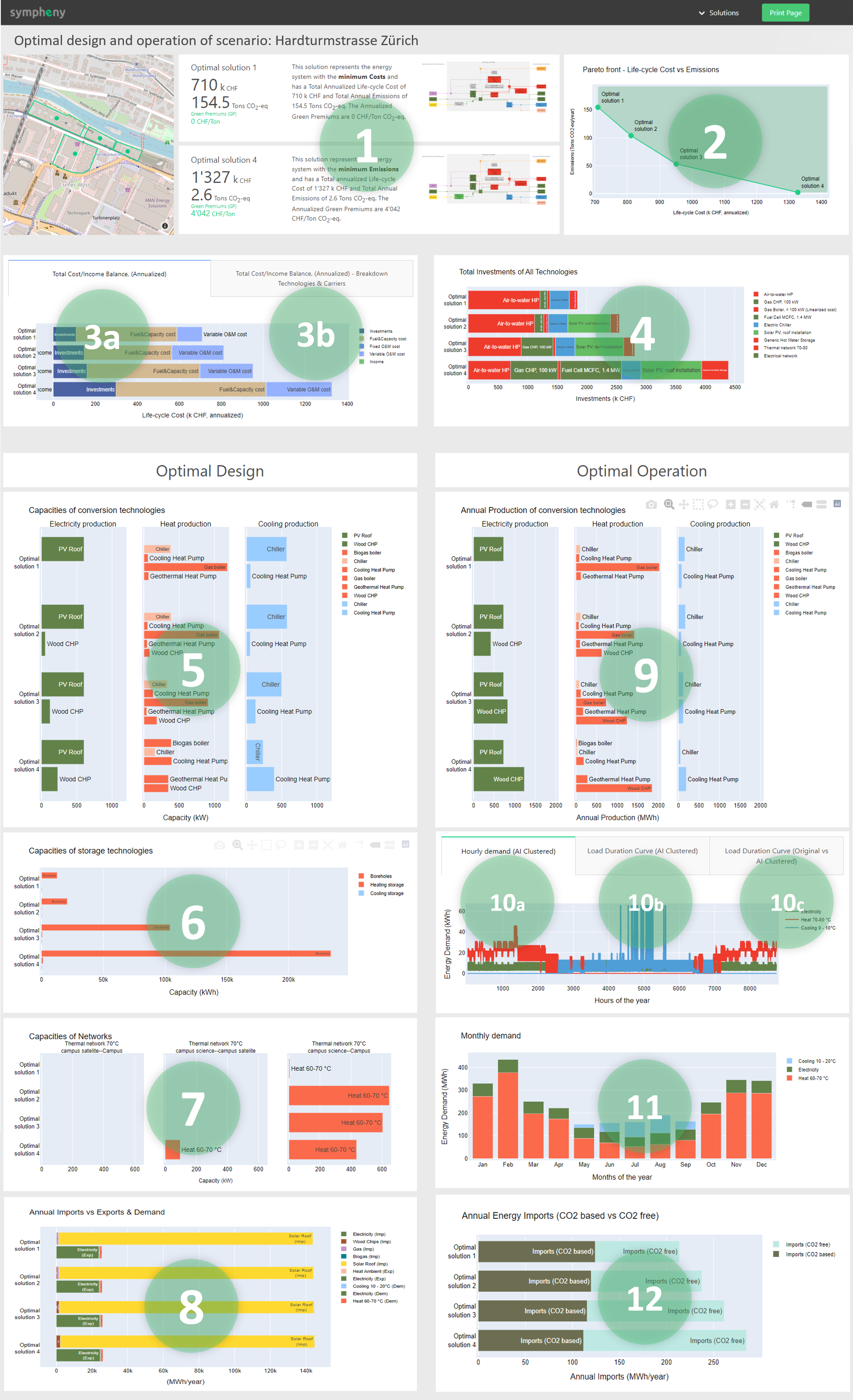
A summary of the objective values of the 2 extreme optimal solutions: minimum Cost solution and minimum CO2 solution
A Pareto Front with the objectives of all the solutions of the scenario executed.
The Total Cost and Total Income balance (annualized) of the energy system of each of the optimal solutions.
Same as previous plot but with breakdown of technology costs.
The Total Investments of the chosen optimal technologies -Conversion, Storage and Network Technologies- for each of the solutions.
Selected technologies and optimal capacities (kW) chosen by Sympheny engine for each of the solutions of the scenario. The capacities of multiple output energy carrier Technologies are also shown here.
The storage technologies with their calculated optimal capacities (in kWh) chosen by Sympheny engine for each of the solutions of the scenario.
The network technologies with their calculated optimal capacities (in kW) chosen by Sympheny engine for each of the solutions of the scenario.
Total Annual Imports vs Annual Energy Demand and Exports of all hubs aggregated in MWh/year.
The Annual Energy Production (in MWh) of each of the chosen technologies for each optimal solution. Multiple output energy carrier Technologies are also shown here.
The hourly energy demand profiles of the system. The AI Clustering algorithms of Sympheny simplifies these profiles in typical periods.
Similar plot to the previous one but as a Load Duration Curve.
A comparison between the original Load Duration Curve and the AI Clustered curve by Sympheny algorithms.
11. Same as previous demand plot but monthly
12. Energy of Imports with CO2 vs Energy of Imports without CO2 (MWh/year).
Solution dashboards (one for each solution)
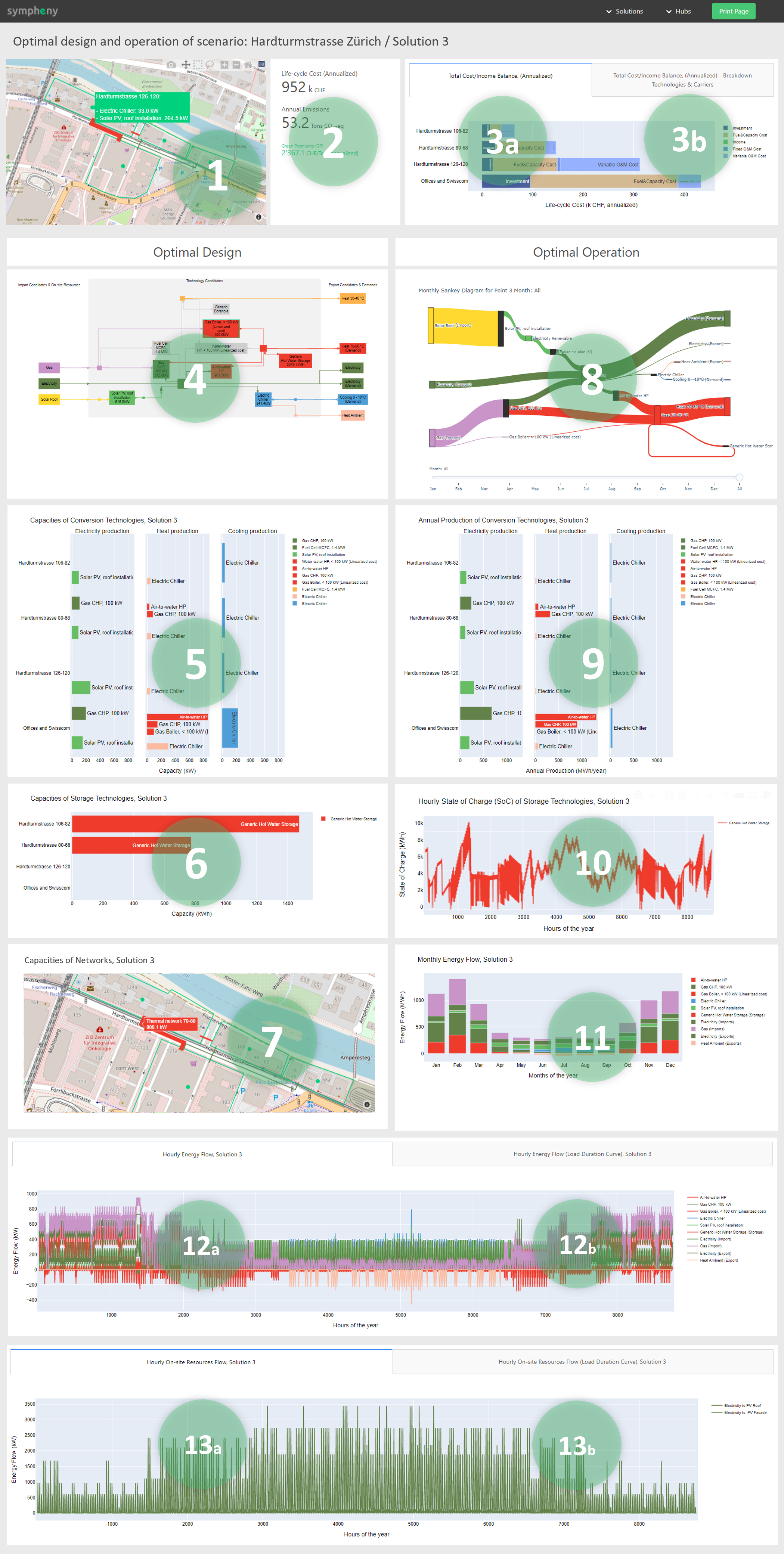
Map with overview of Optimal Technologies and Networks with their capacities
Objective results of the optimal solution selected: Total Life-cycle Costs (Annualized) and Annual Emissions.
Green Premiums in CHF/Ton CO2 (Annualized). These represent the additional cost invested per ton of CO2 emission reduction compared to the minimum cost Solution (Solution 1).
Sustainability Labels:
Autarkic System: When the total annual Imports (excluding On-site resources) of the system are equal to 0
Fossil Fuel Free System: When the annual Fossil Fuel based Imports of the system are equal to 0
Net-zero CO2 System: When the annual net CO2 emissions of the system are equal to 0
Total Cost/Income balance (annualized) across the hubs of the system.
Same as previous plot but with breakdown of technology costs.
This is the energy system diagram with the chosen technologies by Sympheny engine highlighted in colour. (Those not selected are in grey)
This plot of optimal capacities is similar to the one in Scenario dashboard but divided in hubs
This plot of optimal storage capacities is similar to the one in Scenario dashboard but divided in hubs
Map with optimal Network Link capacities
This Sankey diagram represents the flow of energy from Imports (left side of system diagram), through Conversion Technologies & Storage Technologies, to Demand & Export (right side of system diagram).
This plot of annual productions is similar that of Scenario dashboard but divided in Hub.
This plot represents the Hourly State of Charge of the chosen Storage technologies throughout the year. The optimization assumes the same SoC for the first and last day of the year
This plot represents the following energy flows aggregated in months:
Output energy flow (+) of Conversion Technologies
Charge (+) and Discharge (-) energy flow of Storage Techs
Energy flow of Imports (+)
Energy flow of Exports (-)
This plot is equivalent to the previous one but with hourly energy flows
This plot is equivalent to the previous one but as a Load Duration Curve
Be aware that the maximum output of the Conversion Technology (max value in this plot) doesn’t necessarily match the Optimal Capacity of the Conversion Technology. This is because the Technology might be dimensioned for a specific hour of the year with lower potential. For example the m2 of a PV panel dimensioned to produce the highest output for a day in winter (with low solar potential)
13.
a. Hourly On-site Resource energy Inputs and the Curtailment are represented in this plot (kWh)
b. This plot is equivalent to the previous one but as a Load Duration Curve (KWh)
Hub Dashboards (one for each Hub)
These dashboards provide similar type of information as the Solution dashboard but divided in Hubs.